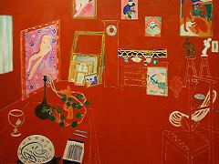
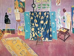
L'Atelier Rouge , 1911 by Henri Matisse
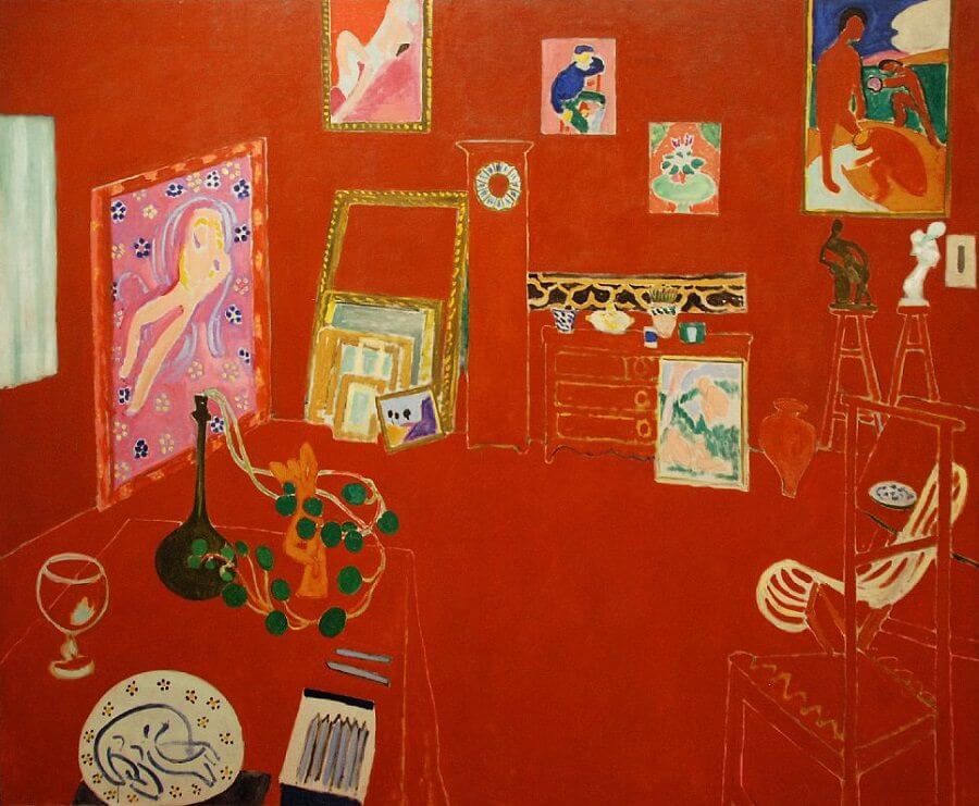
L'Atelier Rouge (The Red Studio) features a small retrospective of Matisse's recent painting, sculpture, and ceramics, displayed in his studio. The artworks appear in color and in detail, while the room's architecture and furnishings are indicated only by negative gaps in the red surface. The composition's central axis is a grandfather clock without hands - it is as if, in the oasis of the artist's studio, time were suspended.
Since Manet, (Degas, Cezanne, and Claude Monet), artists have sought to undermine the illusion of space that had ruled painting since about 1425. Spatial illusion was increasingly seen as a defect that reduced the integrity of painting. But as the earlier painters of the avant-garde have shown, ridding a painting of illusion is almost impossible. The audience is trained to expect three dimensional space and sees it given the opportunity. This is Matisse's challenge. He meets this challenge - the destruction of spatial illusion, in three stages.
Red is often thought of as the most aggressive color. It has the most punch, and that's what Matisse needed here. This canvas was a part of a series, there is, for instance, a Pink Studio too. But that canvas was concerned with different issues. Here, the red is an attempt to find a color that is forceful enough to resist the illusion of deep space by pushing to the surface. The red is, of course painted onto the flat canvas but actually fails to remain there visually. Instead, the red becomes the walls and furnishing of the room seen in space. Illusion triumphs - Matisse is thwarted.
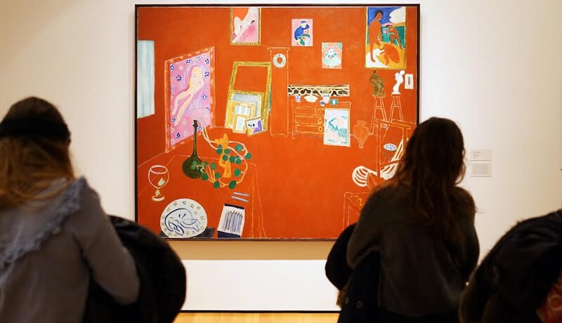
This triumph of illusion is due in part to the linear perspective that defines the table, chairs, and the walls and floor of the studio. But look! Matisse has constructed some of the worst linear perspective ever seen. Receding lines should converge, but look at the chair on the lower right. The lines widen as they go back. And look to rear left corner of the room. The corner is defined by the edge of the pink canvas but above that painting, the line that must define the corner is missing! Matisse is literally dismantling the perspective of the room but it makes no difference, we still see the room as an inhabitable space. Illusion still triumphs.


